Client
Powwownow is the UK market leader in conference calling services. However, changes in the UK B2B landscape and user behaviour mean customers are demanding more than just telephony services from their telco providers.
Problem
Help bring the idea of online meetings with a suite of collaborative features to life.
Solution
A thorough user experience audit of the existing Minimum Viable Product identified a number points which needed to be addressed for an initial smoother, less confusing and less anxious experience. After the basics where resolved, the changes were tested and results were in. This led to an all-round more pleasing and productive meeting session.
Deliverables
- User Journey Mapping
- Card Sorting
- A/B Testing
- User Testing
- Interactive Prototyping
- Information Architecture
- High fidelity wireframing
- User interviews
- Interface design
- Animated SVG
-
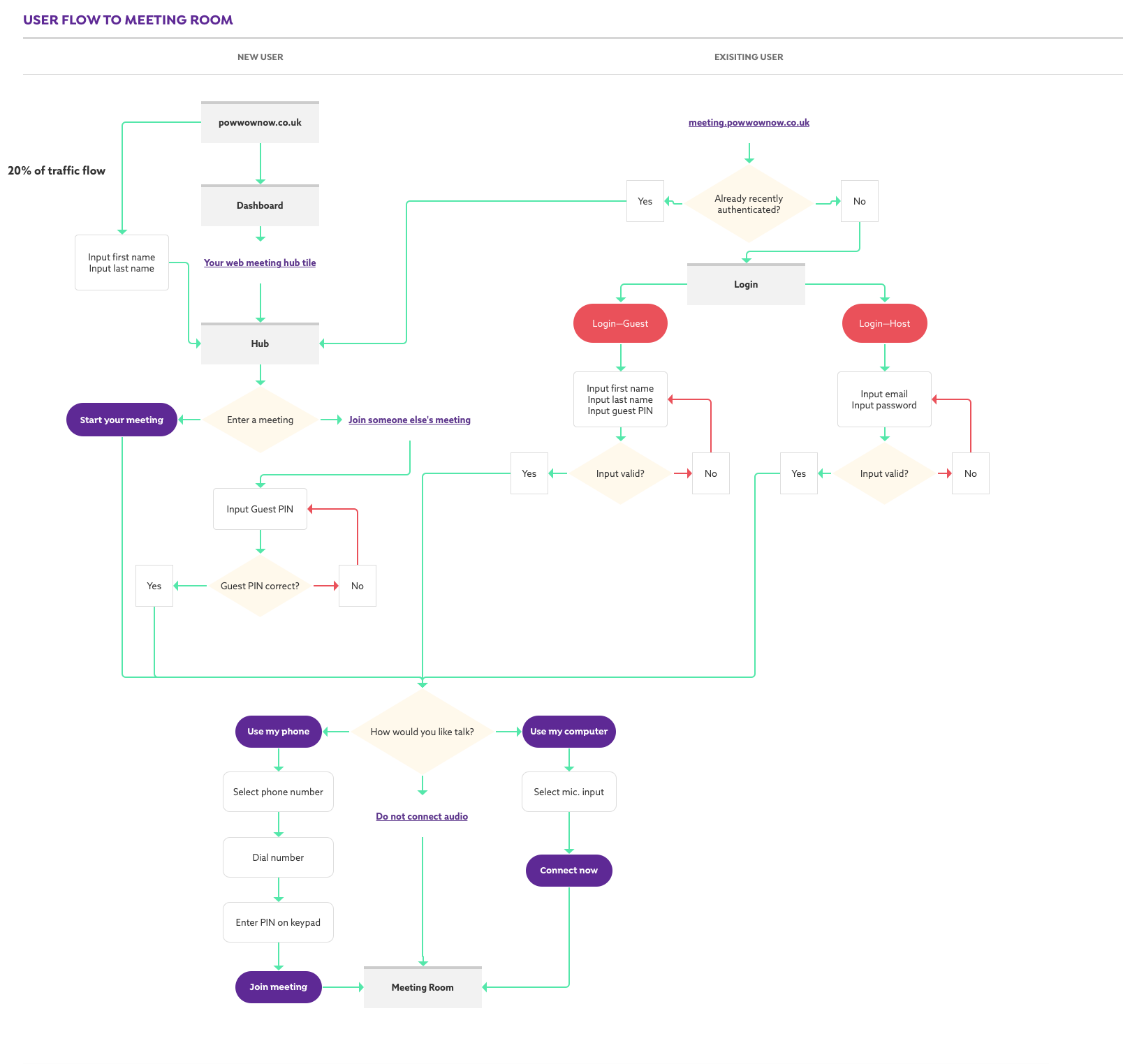
Defining the user journey flow from landing page to product meeting room.
-
An initial user experience audit of the Engage meeting room experience showed the order and icon design choice of the feature menu items needed to be clearer and easier to understand. I used the Icon Preference Test with alternate icons and asked users what they thought the icons meant to them to understand the users' mental model. Key functionality such as 'Leaving the meeting room' and 'Record meeting' were vastly improved with a simple more familiar icon and background colour.
Before UX audit →
← After UX audit
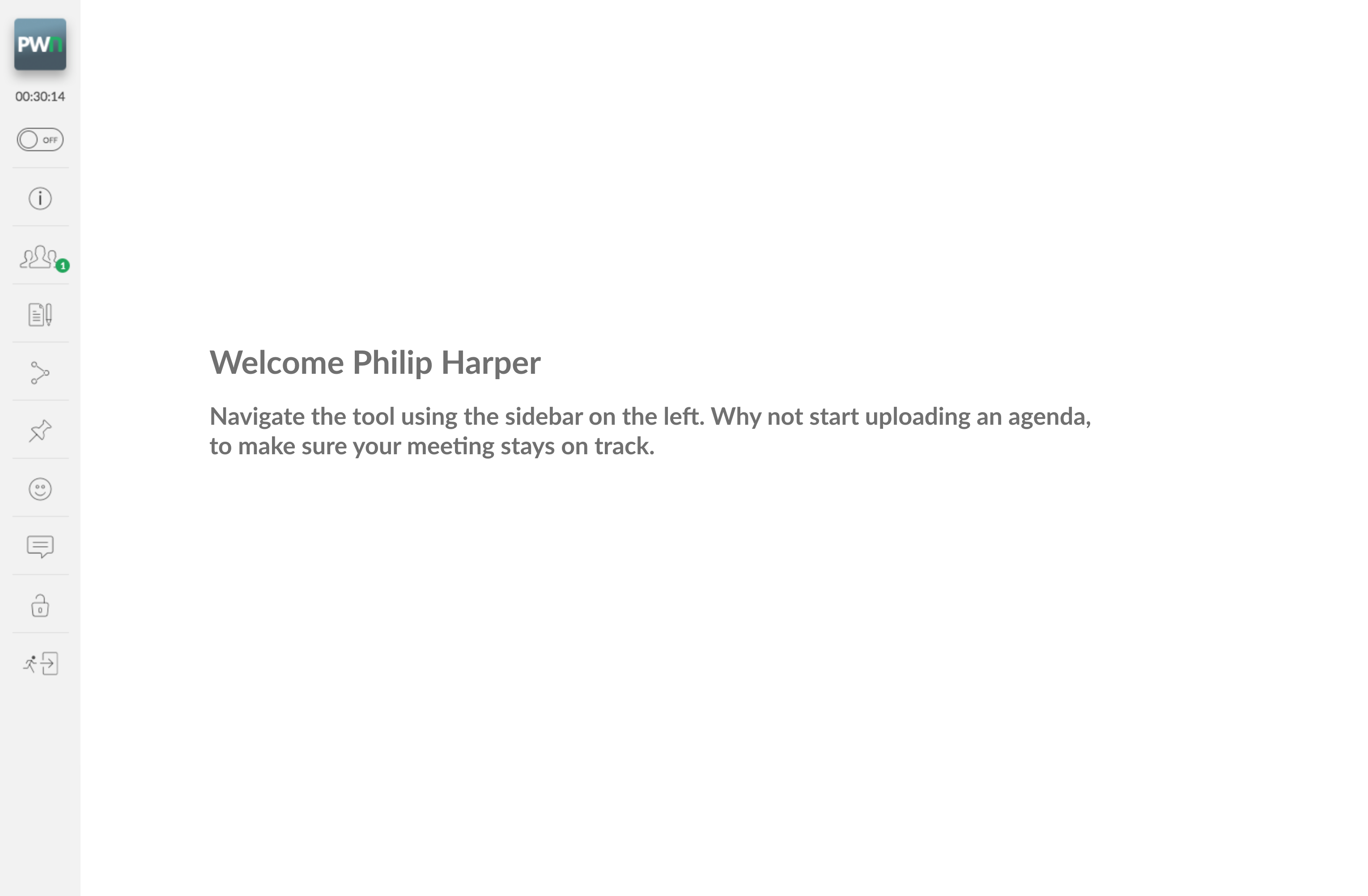
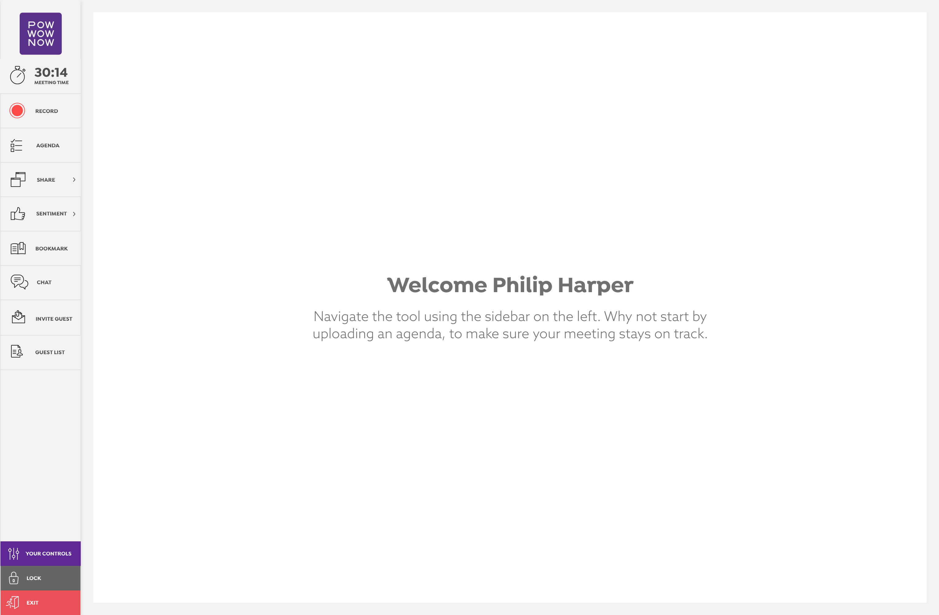
The following changes were conceptualised, user-tested and proved to improve overall user satisfaction and product engagement.
-
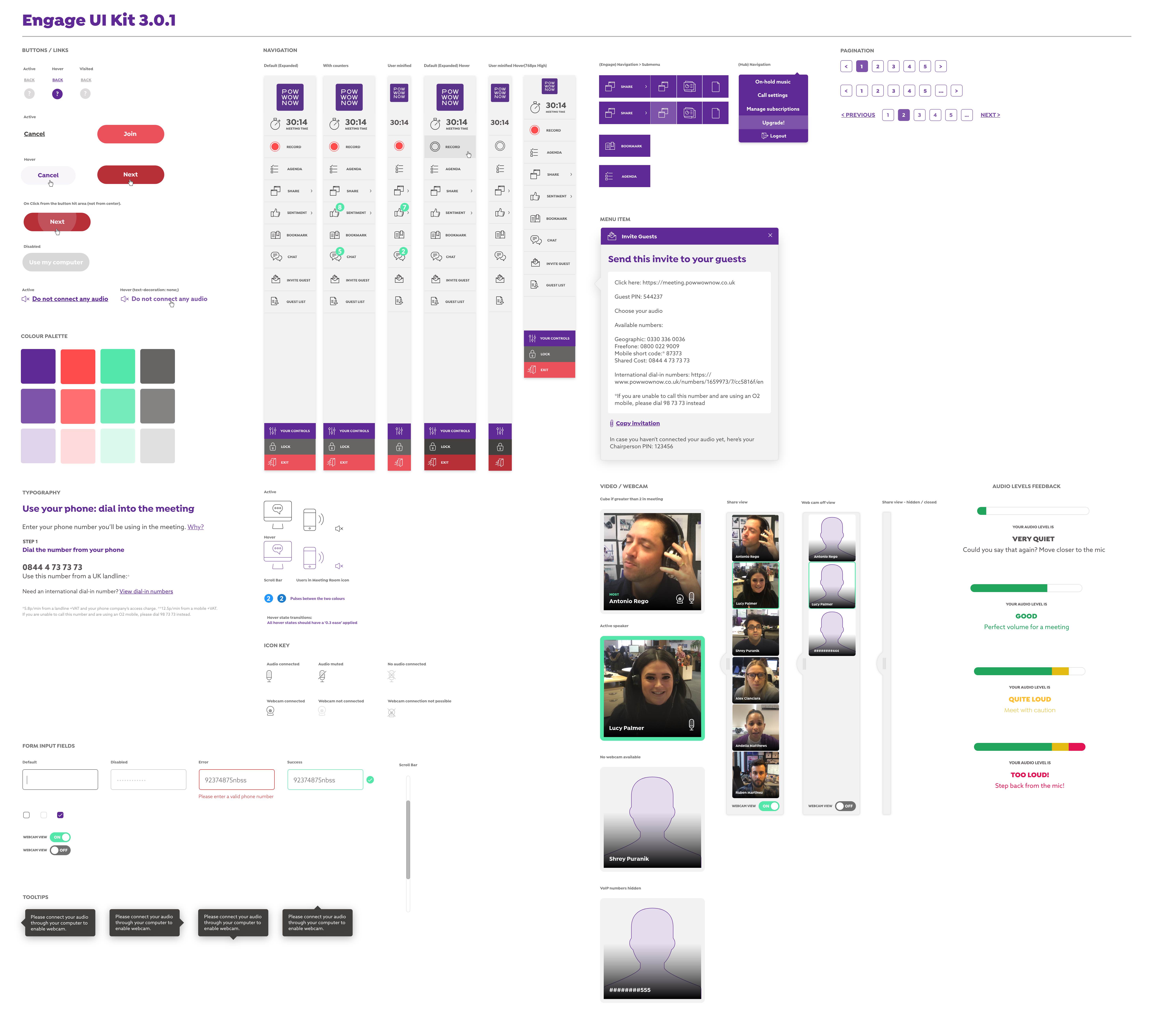
Engage UI Kit
-
Animated SVG loader — This little animation provides the user with something to look at whilst they wait for the meeting host to join the meeting. Written in HTML and CSS.
-
Feature – Presenting an Agenda to the meeting participants.
-
(New customer) User Flow – Tablet
-
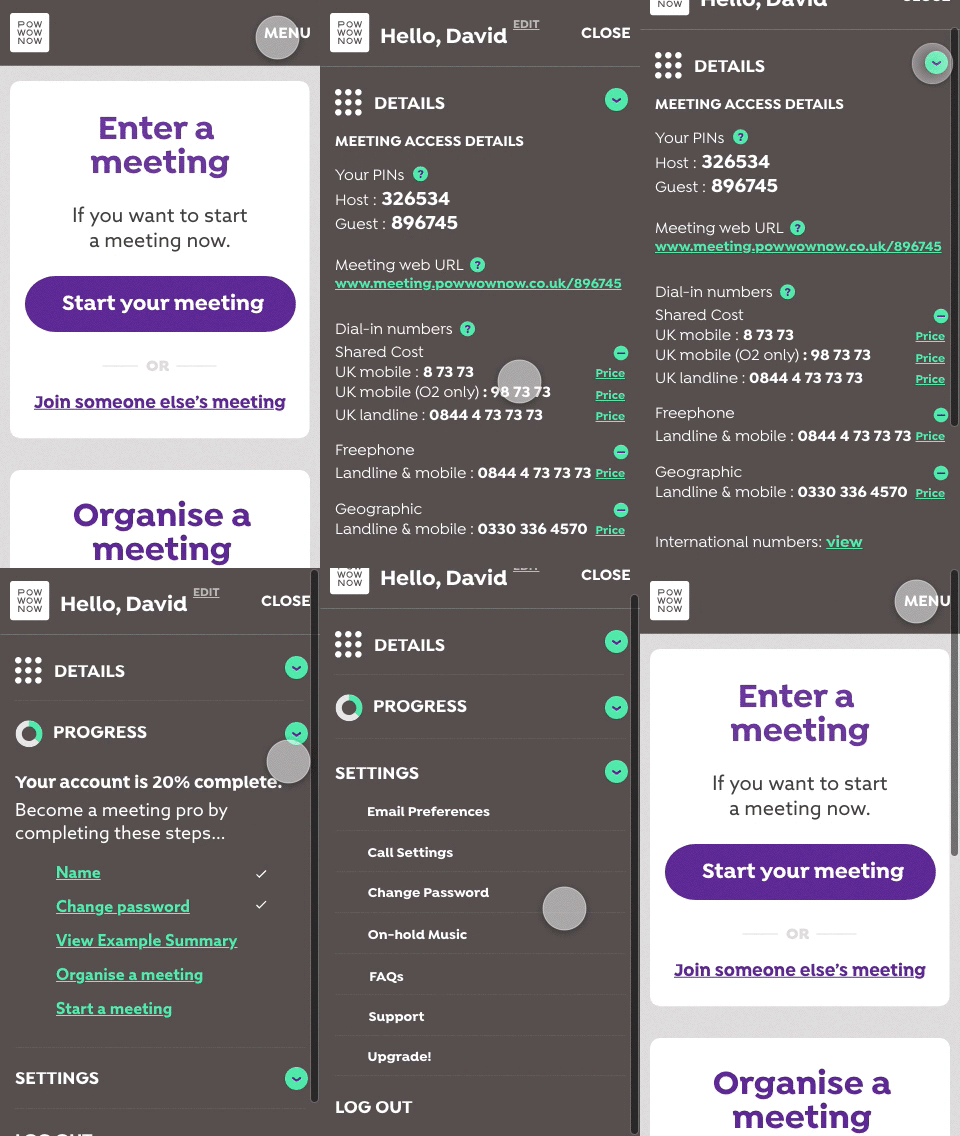
Engage on mobile — an example of the mobile navigation within the Hub area of the product.